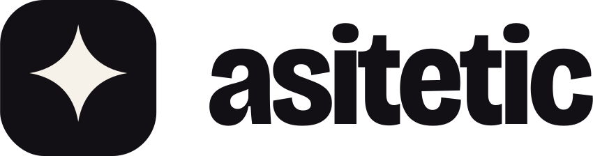
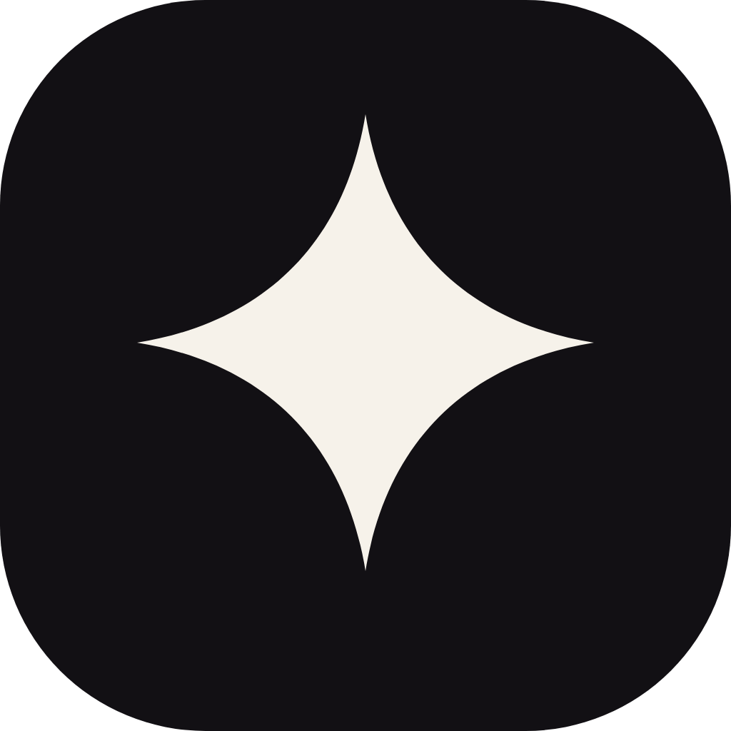
A four-point spark in a rounded square, next to our name in lowercase. The spark is the AI that builds; the square is the site it builds into. Lowercase keeps it friendly: we're a tool for small businesses, not a bank.
Primary, on PaperOn NightOne colour, on TangerineOne colour, ink
The mark
Use alone where space is square or tiny: app icon, social avatar, favicon. Corner radius is 9/32 of the side. Never redraw the spark.
The wordmark
Bricolage Grotesque ExtraBold, outlined. Use alone only when the mark already sits nearby, such as inside our own product.
Asitetic
The name in writing
In sentences it's Asitetic, capital A, never “ASITETIC” or “AsiTetic”. The lowercase form belongs to the logo only.
02
Clear space, size and don'ts
Give the logo room. Keep at least half the height of the mark clear on every side, and don't make it smaller than it can be read.
½ x½ x½ x½ xx
x = height of the mark. Clear space = ½ x on all sides.
96 px wide minimum on screen, 25 mm in print.
16 px minimum for the mark alone (favicon).
Please don't
Stretch or squash it
Change the colours
Rotate it
Add shadows or effects
Put it on busy photos
Rearrange the parts
Fade it out
ASITETIC
Retype it in another font
03
Colour
Warm paper, deep ink and one bright tangerine. Accents add joy in small doses. Tap any swatch to copy its hex.
Paper 60%Ink 25%Tangerine 10%
Core
Accents
Neutrals
Contrast
WCAG 2.1 ratios, worked out from the values above. Body text needs AA (4.5:1); headings and bold labels from 18.5 px need 3:1.
AaInk on PaperAll text16.94:1AAA
AaInk 2 on PaperBody copy10.52:1AAA
AaMuted on PaperCaptions and hints4.81:1AA
AaPaper on NightText on dark sections16.75:1AAA
AaInk on TangerineSmall text on Tangerine6.12:1AA
AaWhite on TangerineButton labels, 18px+ bold3.09:1Large text
AaTangerine on NightAccent words on dark6.04:1AA
AaTangerine on PaperBig display words only2.77:1Decorative only
AaWhite on VioletBadges, small buttons4.55:1AA
AaInk on SunHighlights12.83:1AAA
04
Typography
Two free Google Fonts. Bricolage Grotesque does the heavy lifting; Instrument Serif italic adds a human note, one phrase at a time.
Lede18–21 pxAsitetic writes your pages, picks a look that suits you and wires every form into your inbox.
Body17 pxNothing goes live until you save, and every save can be undone.
Eyebrow13 px capsHow it works
05
How we sound
Like a capable friend who builds websites: plain, warm, confident, and straight with you.
Plain
Short sentences, everyday words. Say what it does, not what it “leverages”. If a nine-year-old can't follow it, rewrite it.
Honest
Only claim what ships. No invented reviews, numbers or logos. If something's coming later, say “coming soon”.
Warm
Talk to one owner, as “you”. Celebrate their business, not our technology. A little wit, never sarcasm.
Confident
No hedging, no hype. “We'll build the website.” Not “we might be able to help you potentially…”.
Do
“Tell us about your business. We'll build the website.”
“Nothing goes live until you save.”
“Bringing your photos across is coming soon.”
Don't
“Leverage our AI-powered synergies to supercharge your digital presence.”
“Trusted by 10,000+ businesses” (unless it's true and counted)
“Unfortunately, an unexpected error has occurred.”
Spelling New Zealand English: colour, organise, centre, enrol.
Headlines Sentence case, no full stop unless it's two short sentences.
Buttons Say what happens: “Build my site”, “Save”, “Import my site”. Not “Submit”.
Errors Say what went wrong and what to do next, in one or two sentences.
The ✦ spark Marks things the AI does. Don't use it as decoration elsewhere.
Numbers Digits for 10 and up and for anything with a unit (“5 pages”, “$29”).
06
Interface
Rounded, soft and tactile. Pills for actions, generous radius on cards, shadows that float rather than outline.
Buttons
Build my siteStart buildingSee the tiers
One Tangerine button per view: the main thing to do. Ink for secondary, ghost for tertiary. White on Tangerine is 3.1:1, so its labels need to be bold and at least 18.5 px (or use Ink text).
Shape
2212pill
Cards 22 px (big panels up to 48 px), small elements 12 px, buttons and chips fully round.
Product frames
yourbusiness.co.nz
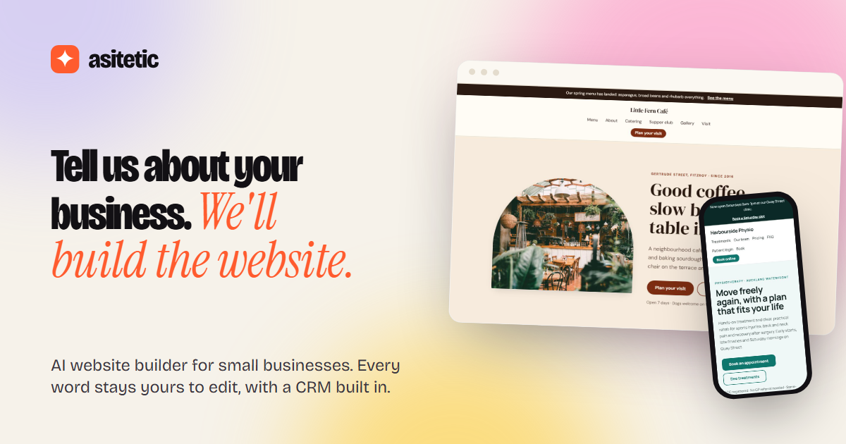
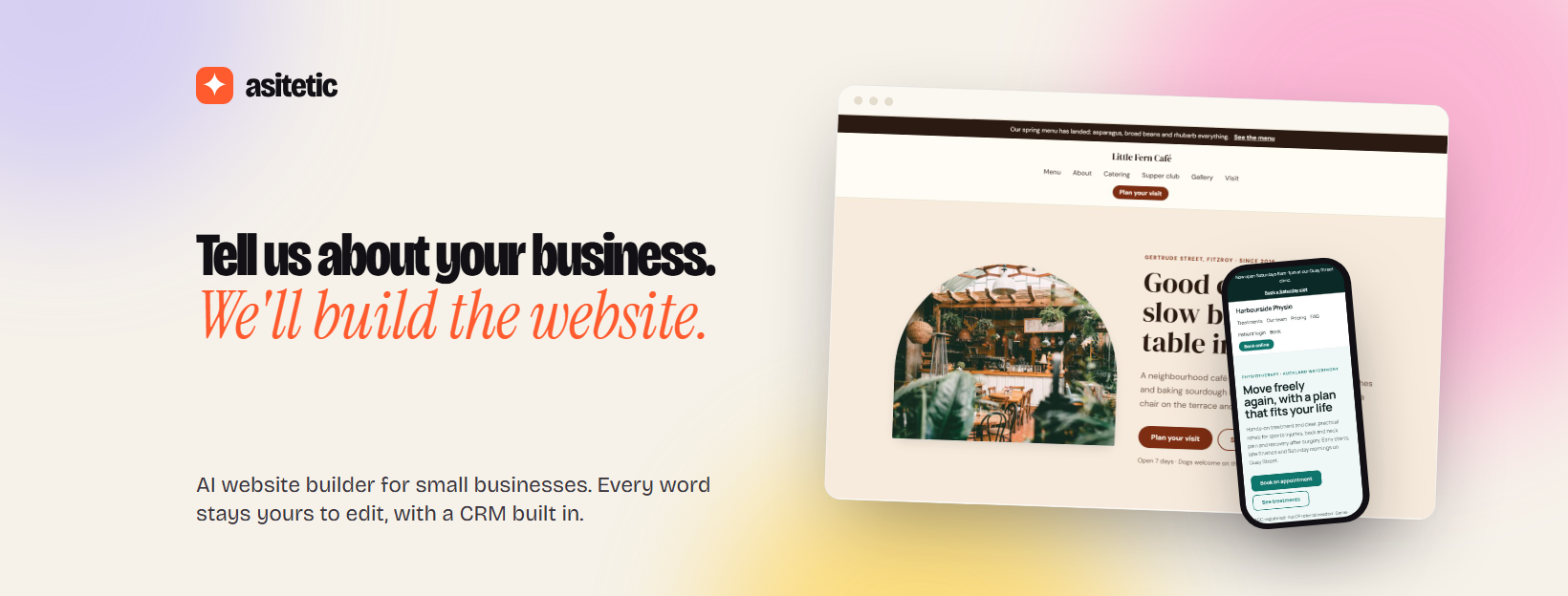
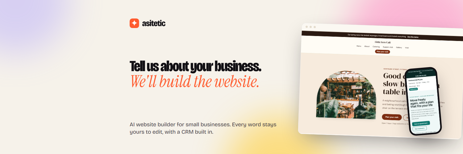
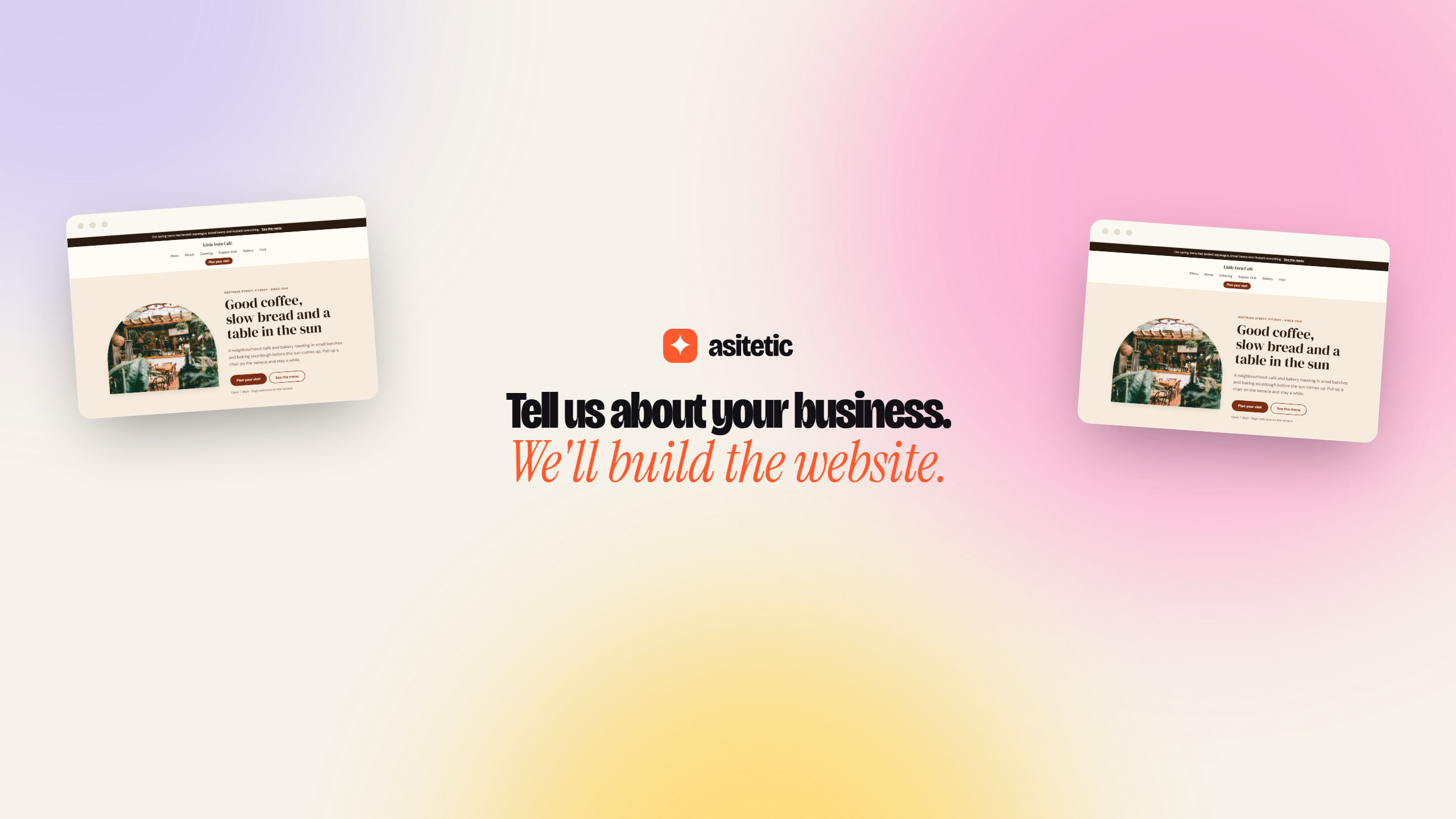
Show the product in a light browser frame, slightly rotated (±1–2°) when it sits beside copy.
Motifs
A ✦ λ 7 Σ # < / > π
Soft colour orbs behind heroes, a living glyph field on sign-up, the spark in 3D. Motion is slow and always honours reduced-motion settings.
07
Imagery
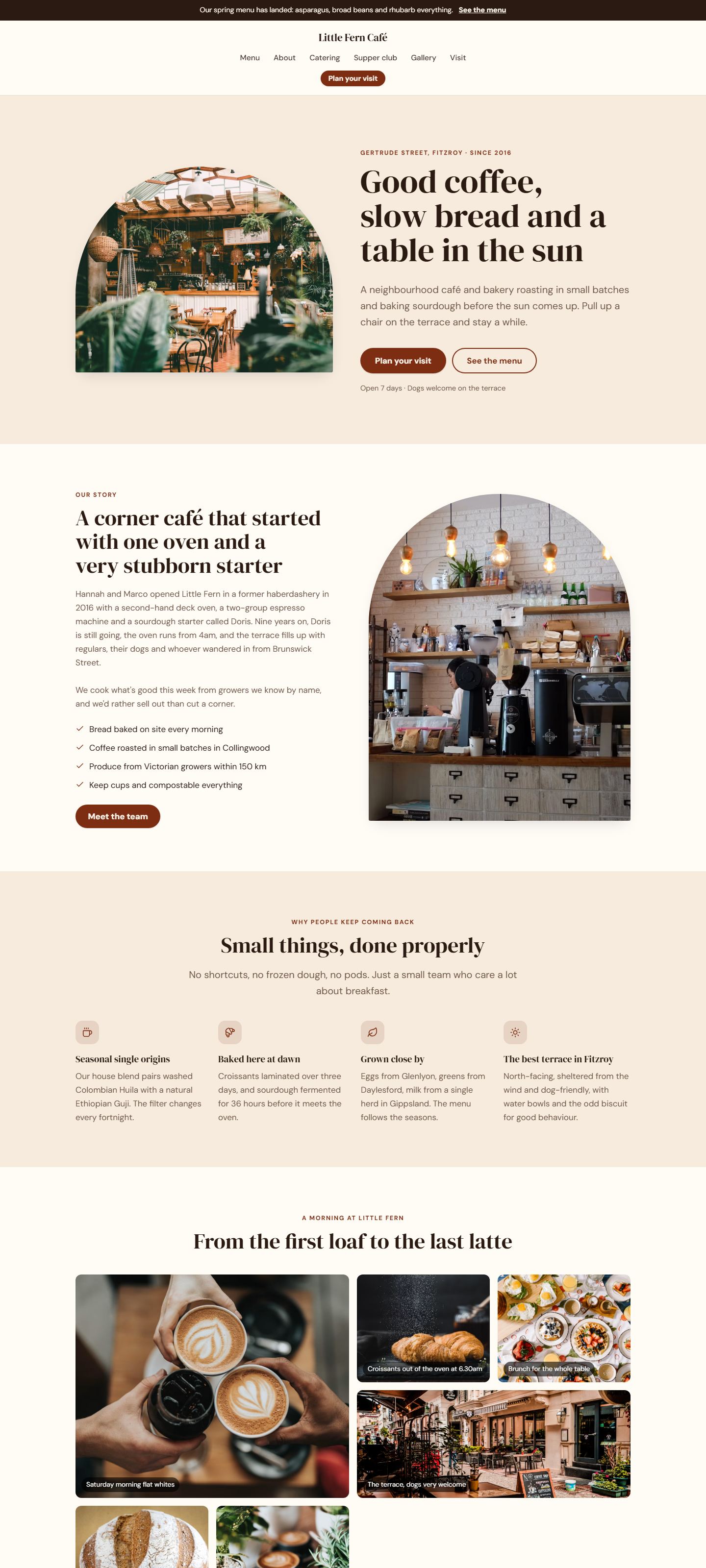
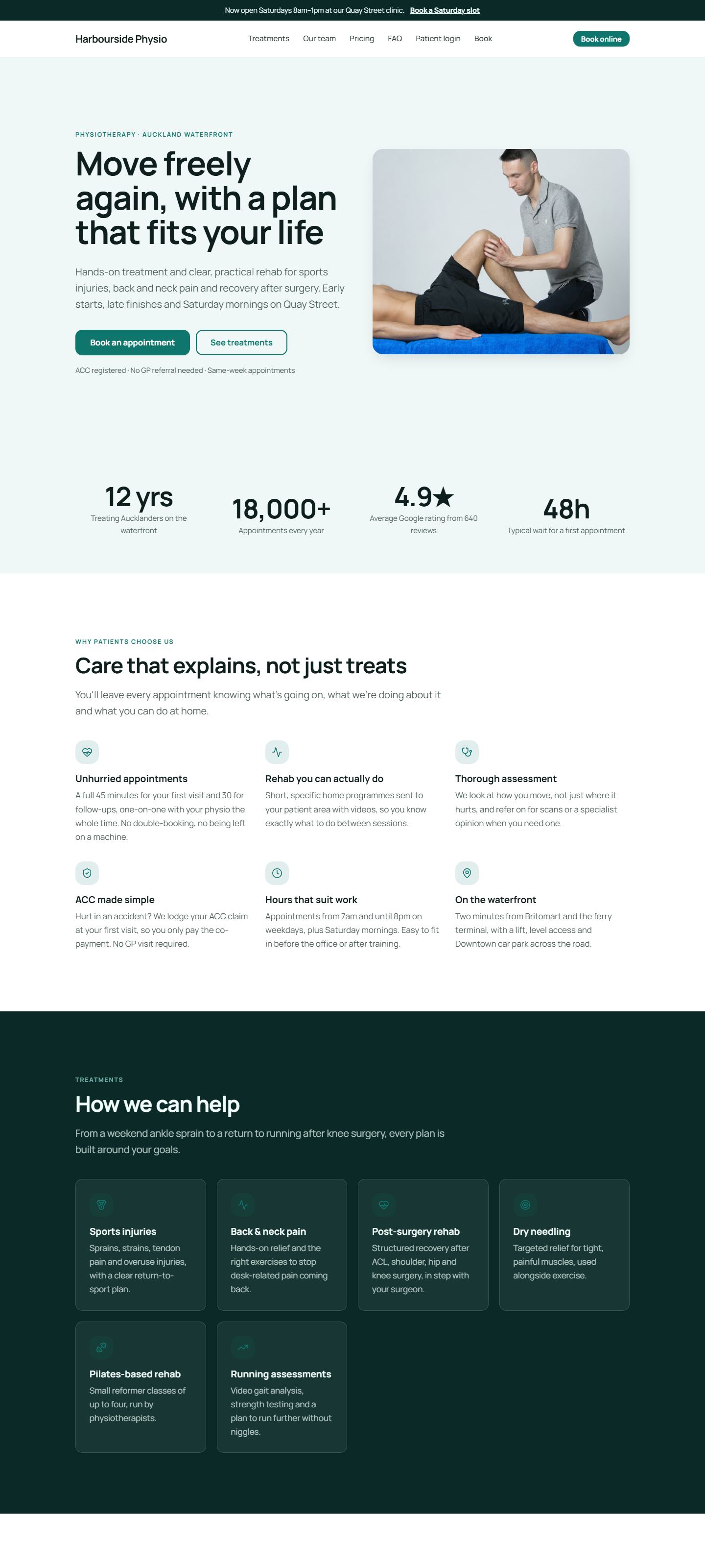
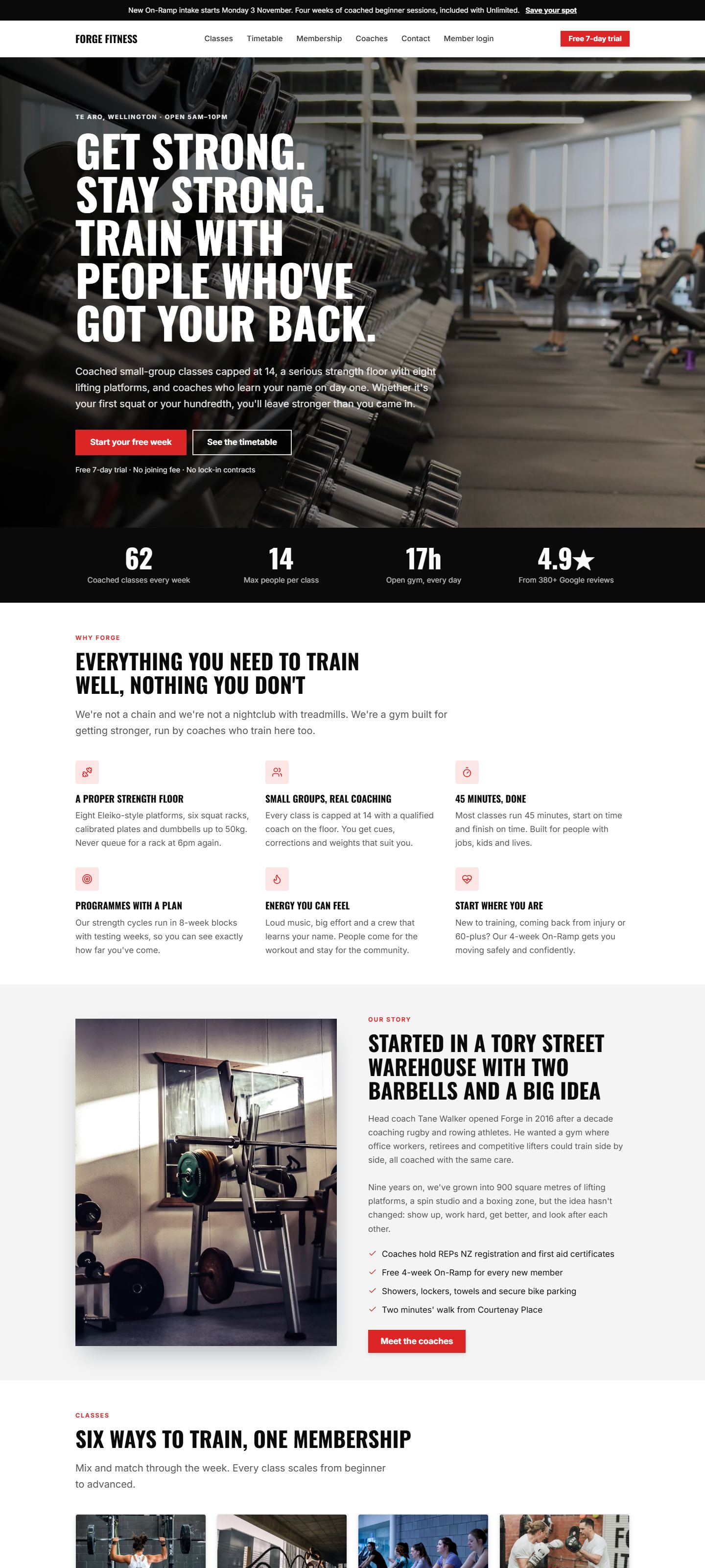
Show the real product and real-feeling businesses. Our customers' work is the hero, not us.
Product shots Real screens, captured from the product (never mock-ups of features that don't exist).
Photography Natural light, real places, people at work. Local where we can.
Avoid Generic stock (handshakes, headsets, glowing brains), robots, and anything that says “AI” with circuits.
08
Downloads
Use SVG wherever you can: it's sharp at any size. PNGs are transparent.